How well do your call-to-action (CTA) buttons convert into a desirable action on your website?
Your CTA buttons are like the stepping stones through your sales funnel. They support your customers and readers from the ad or homepage all the way to the checkout and if they are not effective, chances are your conversion rate will suffer.
Here are 4 all-important factors to consider when designing a CTA button:
1.) Size and Shape
In order to stand out, your CTA button should always be bigger than the text and images around it.
Another factor to keep in mind is that the CTA button should compliment the page- you don’t want it to look out of place but at the same time you want it to grab viewers attention. In fact, one study found that having less empty space on a button increased conversions by 9%.
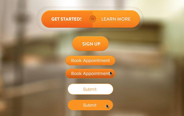
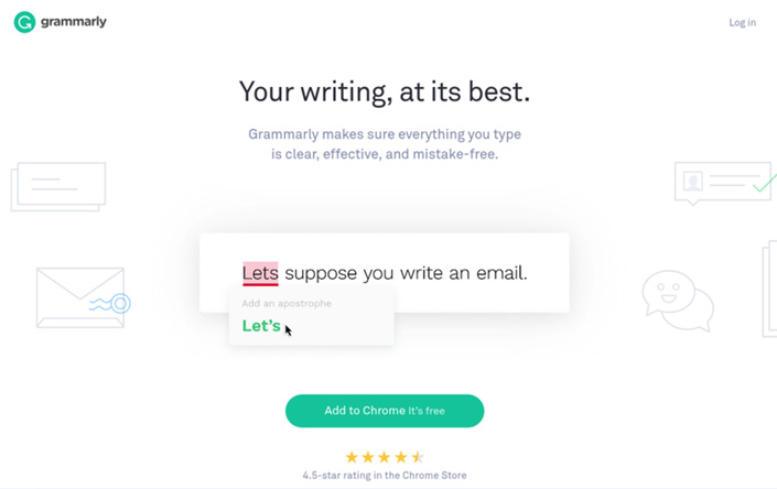
This is a good example of the perfect sized CTA. The button stands out and is large but doesn’t have any empty space- in other words, the text is a perfect fit for the button.

Experiment with different shaped buttons on your site too. Rectangle buttons are the most popular, but you don’t have to follow the status quo. Try a circle shaped button or get creative and choose a product specific shape. Test it out for a few days to see if it helps conversions.
2.) Spacing and Positioning
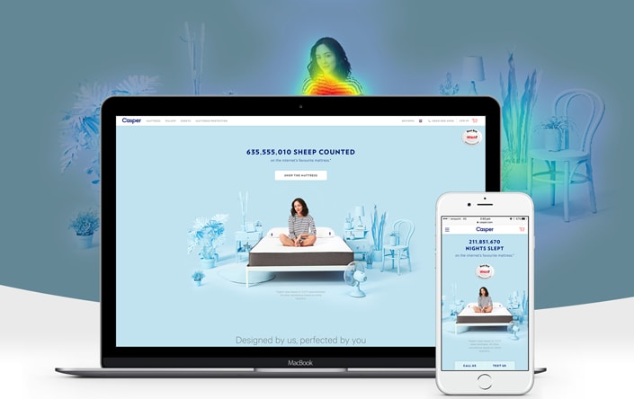
Placing your CTA button above the fold is the most effective area as it allows visitors to instantly see it. Placing a heat map on your site is also a great way to determine where on your page your users are most engaged. Once you have collected this data, move your CTA button to this part of your website and watch your conversions increase.
3.) Color
When it comes to design a good, clean website will use a 3 colour scheme at most. Your CTA buttons however, can deviate from this scheme in order to stand out and catch user attention.
Try to choose a colour that compliments your design but still draws the eye. Here is a good example:
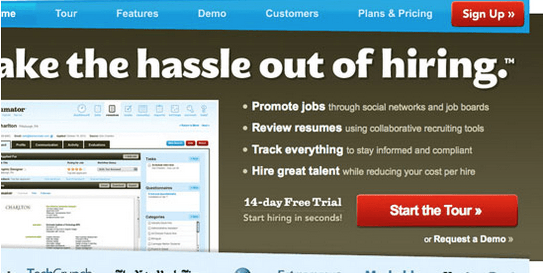 As you can see in this example, the main colour theme of the site is white, blue and brown but the CTA button is red which helps it to stand out.
Another factor to consider when choosing a colour for your button is psychology.
Red is associated with “danger” or “stop” so it may not always be the most effective colour. Green on the other hand, is associated with “positive action” and “go” so it is usually a good colour choice.
Blue is usually the most popular colour when it comes to CTA buttons and this could be due to the fact that it is a very calm, non-aggressive colour that psychologically evokes trust and understanding.
Think about your demographic and then accordingly choose a colour that matches their energy and the overall look and feel of your page.
4.) The Call to Action
The copy on your button plays a huge role when it comes to conversions. You want to compel your readers to take action, so make sure your button text is engaging and also offers information on what they are signing up to or buying. Aim for no more than 5 words to keep it short and sweet.
It can be hard to discern whether your CTA copy is effective, so try testing it out on friends and family or split test different CTA’s to see which offers better conversions. Alternatively, you can take all the guess work out of your CTA’s and hire a professional.
To give you a good idea of effective CTA copy here are a few Case Study examples to get you thinking:
a.) What is a more effective CTA for a Free YouTube to MP3 Converter site?
“Download” OR “Get your FREE Converter”
Answer: Get your FREE converter had a 10.94% increase in conversions.
b.) What is a more effective CTA for a Landing Page Creation Site?
“Start your free 30 day trial” OR “Start my free 30 day trial”
Answer: Start my free 30 day trial had a whopping 90% increased conversion rate.
Remember the “action” in your Call-to-Action: tempt your customers into clicking by offering an action (verb) that will lead to a result.
Your CTA button Checklist:
- Is your CTA button visually striking?
- Does your copy engage users to take action?
- Is your copy under 5 words?
- Is your CTA actually action-orientated?
- Is your CTA button in an easy to find spot?
- Is your CTA button a contrasting colour that still compliments your site?
- Is your button large enough but not so large that it distracts users?
- Is your CTA easy to understand and accurate as to where your users are being redirected?
If you would like to talk about your Call to Actions and perhaps receive some guidance on whether you can improve them, why not contact us here.

Hey!
It looks like you're browsing in . Would you like to switch over to the website?