Online Marketing Review #1 – StickerMule
We are going to take you step by step through the design, optimisation and onboarding of StickerMule, an online store that allows you to create and design your very own stickers.
Through this example you will be able to see first hand how your website compares and what changes you may, or may not want to make.
First, lets start with…
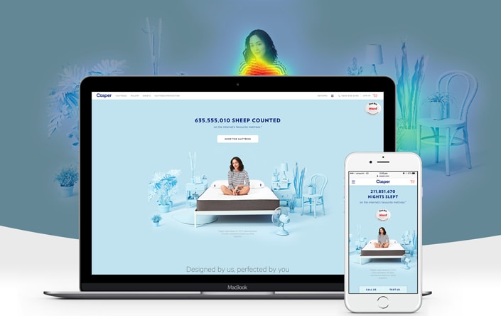
The Homepage:
They say you should never judge a book by its cover but when it comes to your Homepage or Landing Page, first impressions mean everything.
Take a look at StickerMule’s opening page. It is clear, easy to navigate and offers a little quirky style and personality.
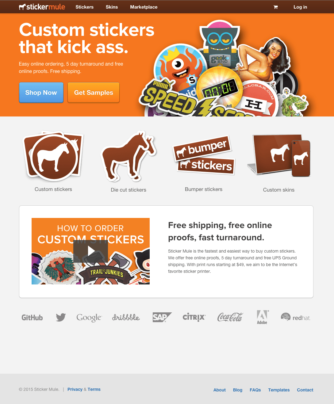
The homepage very easily and clearly points out what they are selling. Stickers. Nothing more, nothing less. They have made it very clear.
Also notice how there are no unnecessary noises or distractions? Having a busy homepage can lead your customers astray from what you want them to do. By limiting their options, they are more likely to take the preferred action.
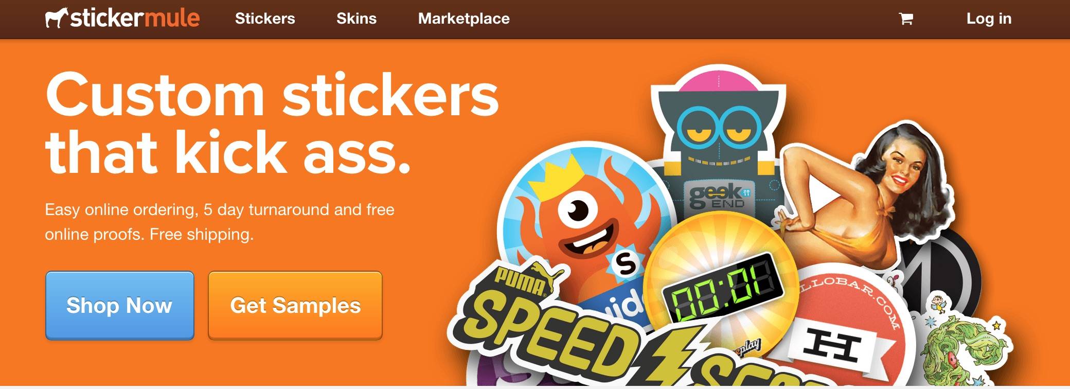
Their call-to-action: “Shop Now” is also in clear eye-line and instantly grabs user attention. The blue coloured button also makes it stand out, especially because StickerMule seems to stick to a three colour theme- orange, white and brown.
One thing that should be noted here however, is the weak call-to-action. “Shop Now”could definitely be replaced with a more specific action such as “Design Your Sticker Now” or “Choose Your Design”.
Whenever you have multiple ideas for your landing or home page, it is always important to split test them to see what is or isn’t working. Sometimes even changing one word or one placement can make a huge difference. This is where it may help to have an expert come on board to help you.
One other thing to mention about StickerMule’s Homepage is that they have made it a point to note the process. They highlight the fact that you get access to free online proofs, free shipping and that the whole thing can be in your hands in just 5 days. This helps to reassure the customer and notifies them of what lies ahead through the checkout process.
The Product Page:
As you can see StickerMule continues with their clean, three-colour layout, making it easy for users to navigate. Instead of offering confusing dimensions or excess details, they make it easy for customers to select what they are after.
Once a customer has entered your store, you want to make the process fun and simple so there is no opportunity for them to back out of completing the sale.
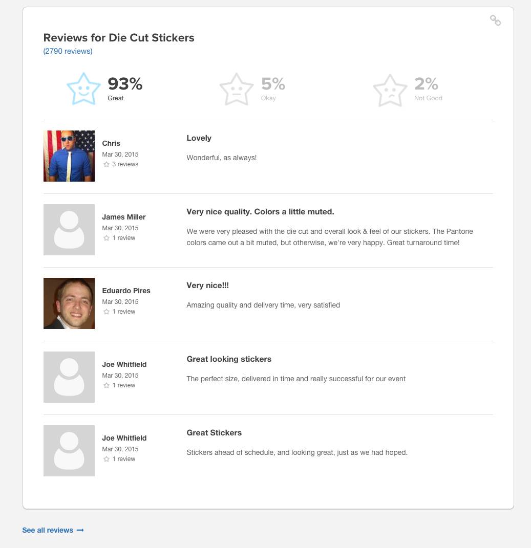
At the bottom of the page they have also offered reviews and social proof to keep customers engaged and reassured.
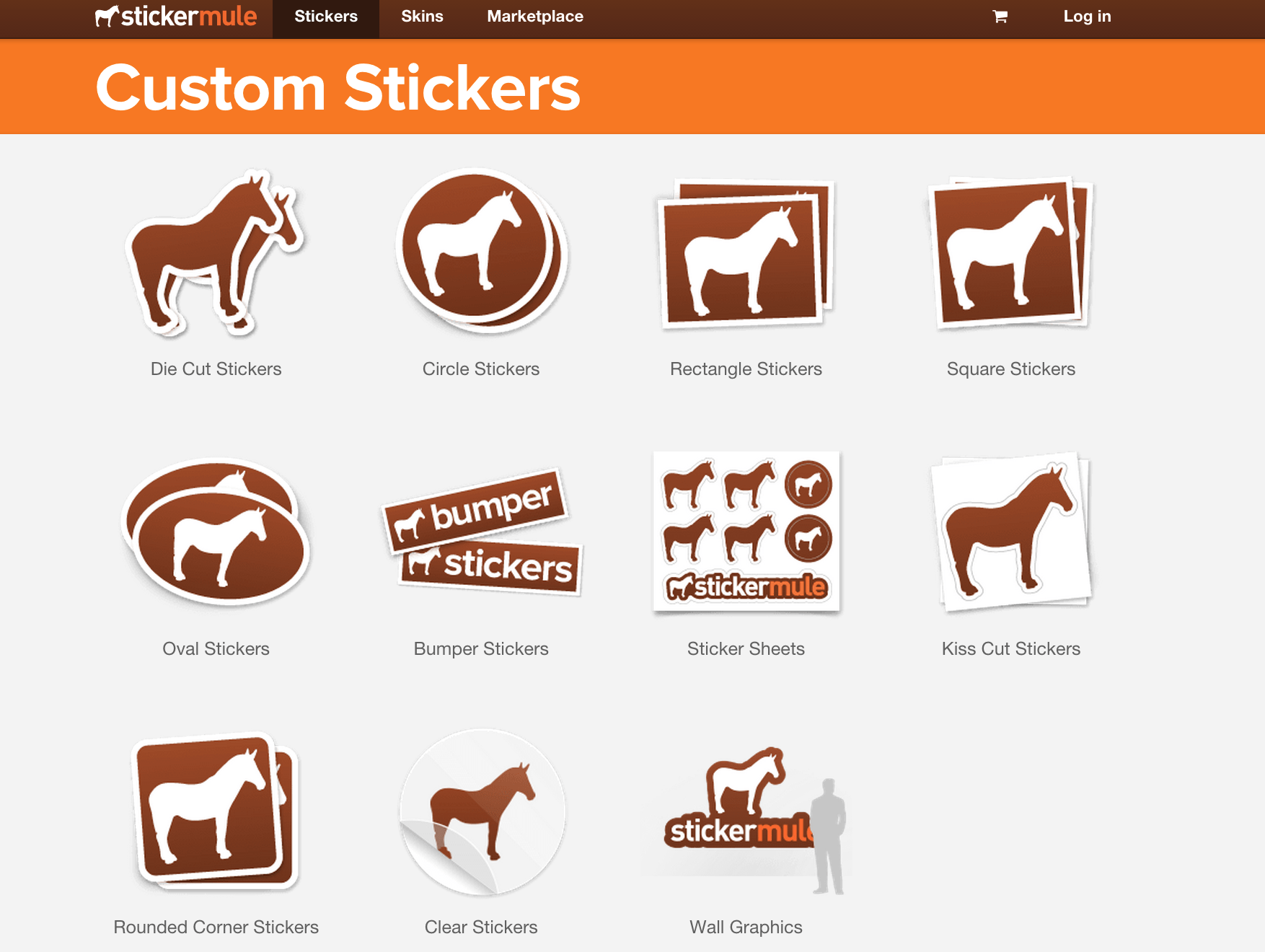
The Product Selection Page:
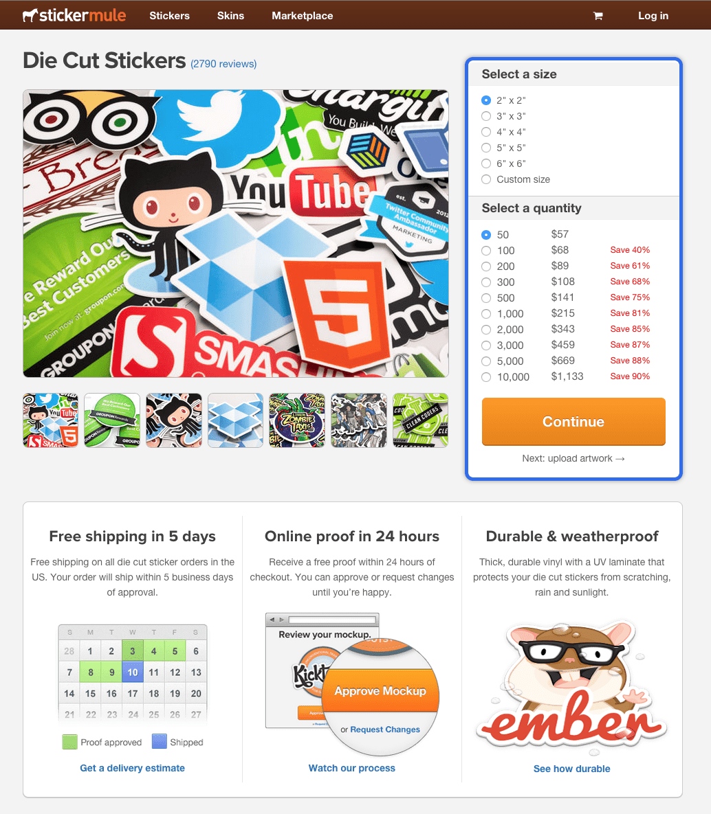
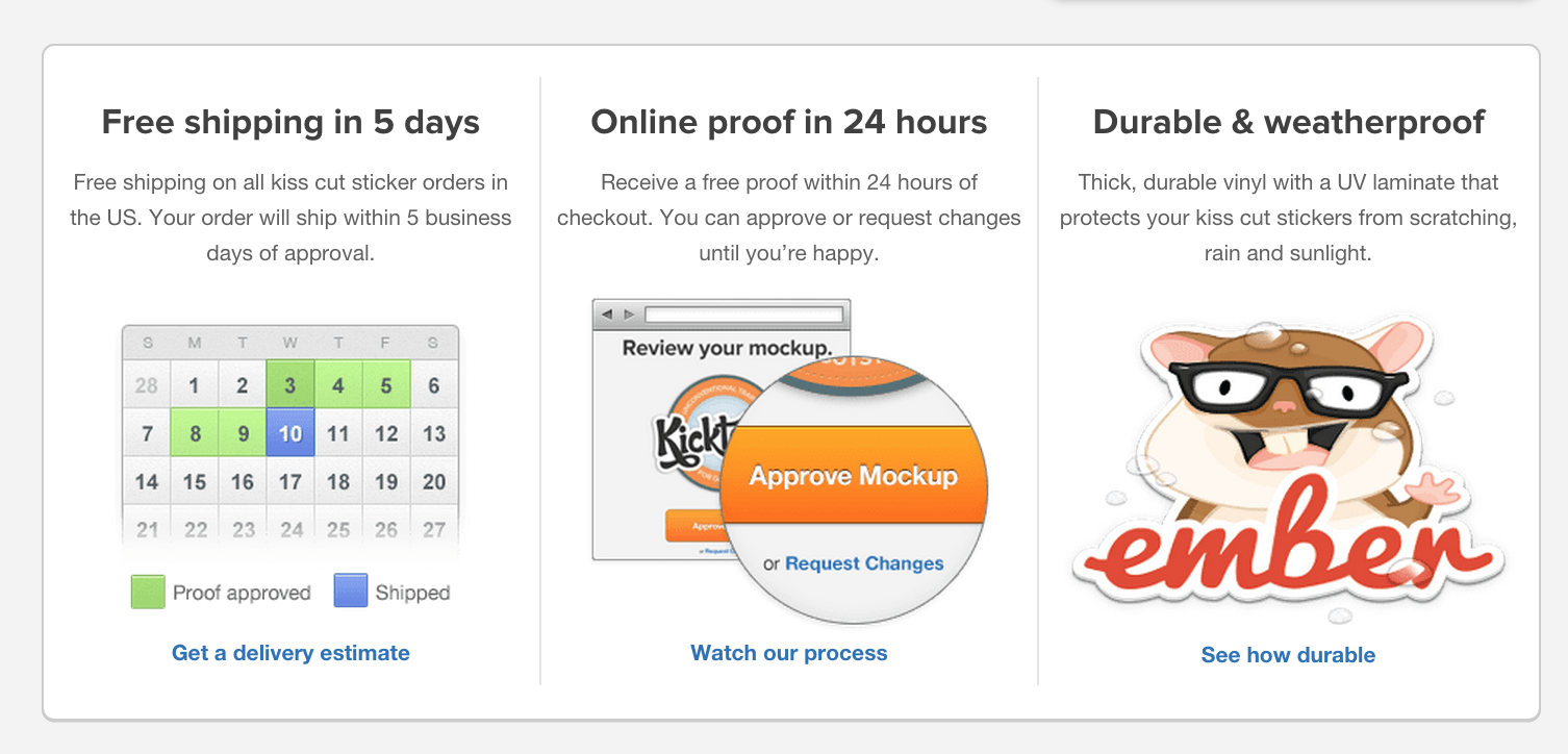
This where StickerMule starts to add a little more content. On this page they remind the customers of the benefits and also highlight the sizes and prices.
Notice the size and price box to the right- looks a bit overwhelming doesn’t it? It may be in StickerMule’s best interest to simplify this a little. Perhaps a good suggestion would be to offer a size sample of each, or perhaps they could even separate the price and the sizes into two different sections as to not overwhelm.
On this page, StickerMule also offers customers a chance to get better acquainted with their product.
These actions offer the customer more information which is good idea as long as they are not distracted from the checkout process. It is worth noting that when you click on any of these actions, StickerMule simply has a pop up over the same page so customers are never redirected.
If you do offer any additional information through your checkout process, it may be worth having a pop up on the same page that they can easily exit out of and continue with their order.
The Upload Page:
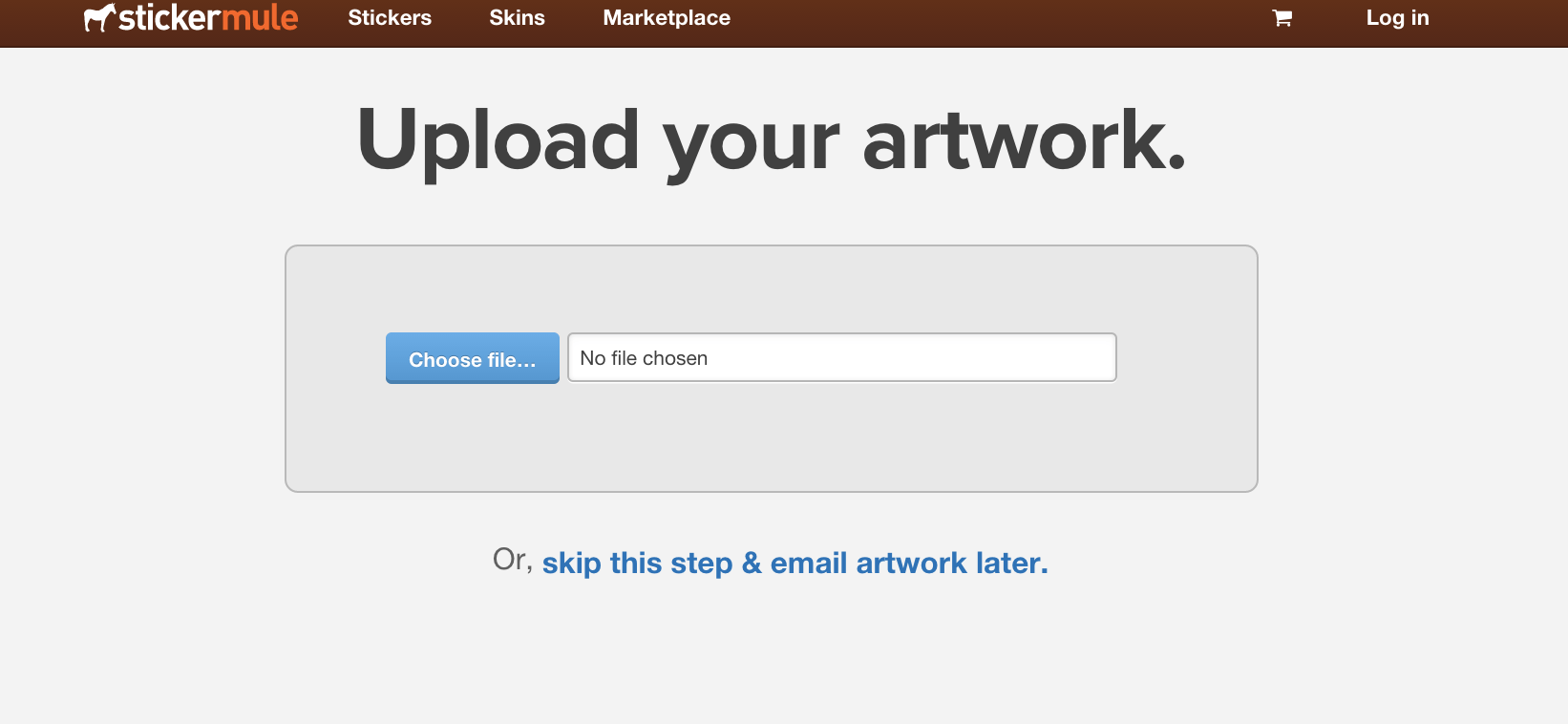
Whenever you have to ask your customers to do anything to complete the sale, this is where you may lose them. That is why it is perfect that StickerMule has offered a “skip this step” option. This probably helps them to retain their customers through the checkout process.
If you require customers to upload or enter unusual details in, it may be beneficial to come up with an alternative. Can you email them for the information after they complete their order? Once a customer has actually paid, they are more likely to offer up the goods.
The Cart Page:
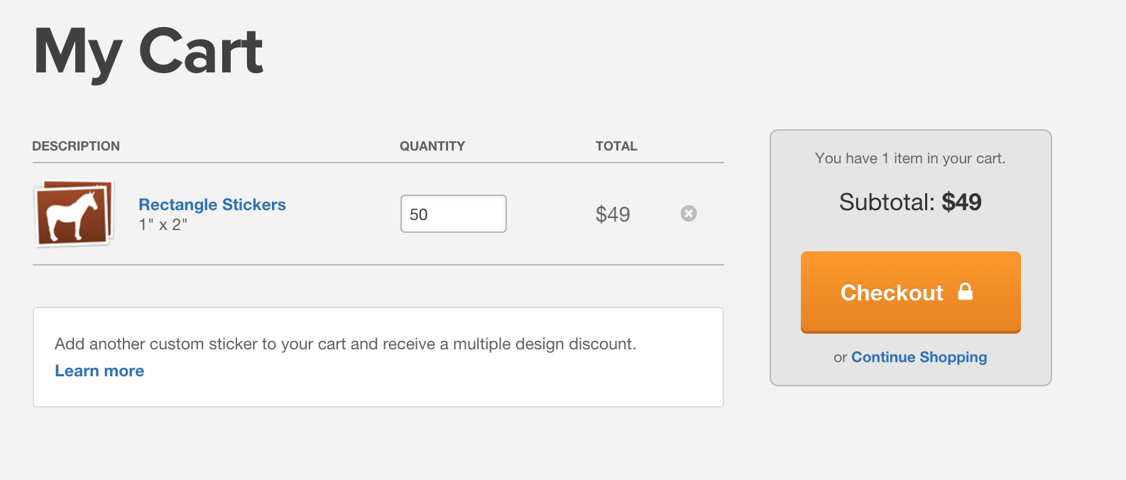
The cart page is clean and distraction free but StickerMule could be enhancing this space a little more.
As you can see they offer the option to add another custom sticker design to their order for a discounted rate using the call to action, “Learn More”.
While the box is low key enough to not cause too many distractions, it almost seems like a waste to have it here. It would probably be better off on the “Thank You” page.
Instead, a simple up-sell such as “Add 20 More Stickers for $1” might do really well here. This way, customers don’t have to go back through the design process.
If you offer a product that can easily be turned into an up-sell, think of an easy, one click way to add it to their cart at this stage. For example, if you are selling face cream it may be a good opportunity here to offer a one click up-sell to an eye cream.
The Checkout Page:
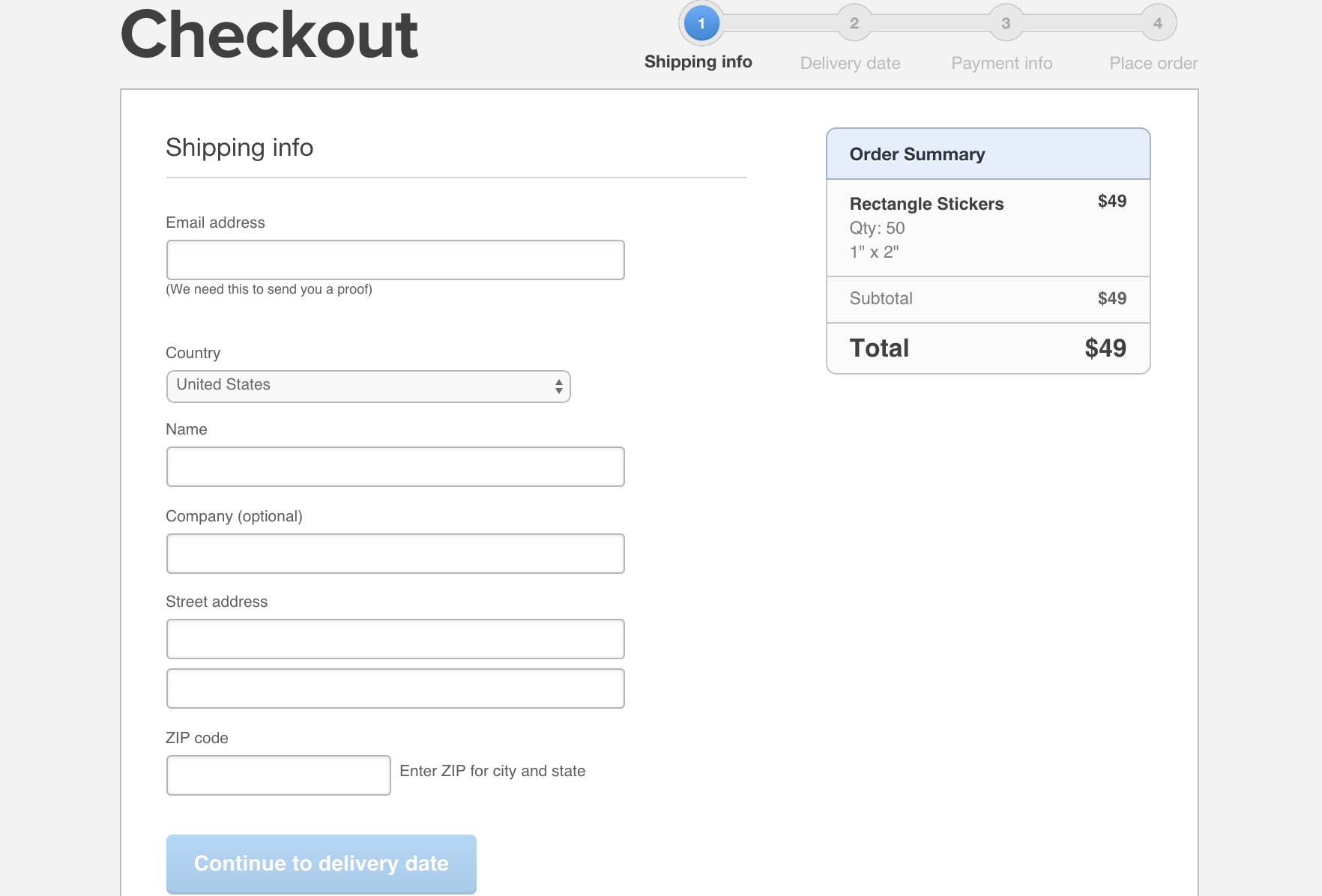
While most checkout pages are fairly uniform, StickerMule has made a few adjustments to really optimise the process.
Firstly, the progress bar on the top right hand side lets you know how many steps to checkout and what you can expect each step of the way. This allows your customer to know exactly what to expect, and that they are close to finishing their order.
Providing an order summary on the side is also an excellent way to prevent customers from hitting the back button to double check their order.
Thank You Page:
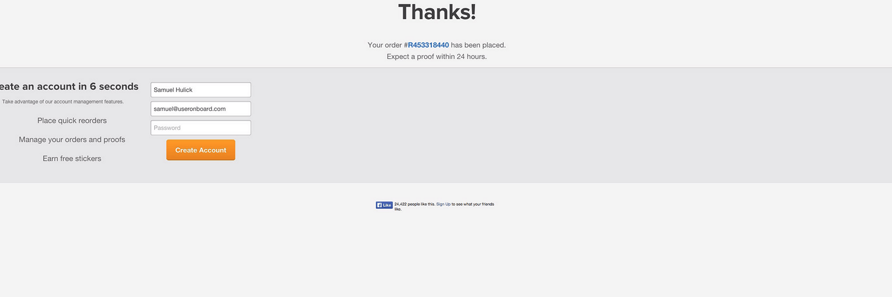
After the checkout process is done, encourage your customers to sign up or join an email list, this way you can constantly stay in contact with them and pitch more products to them.
On their Thank You page, StickerMule asks customers to create an account however, this is not something that people are likely to do after they have finished ordering unless they see a real benefit.
In StickerMule’s case, customers are probably anxious to see their proof, so offering that as a benefit would definitely help to engage customers.
StickerMule lists the benefits, but could do more to promote the process. They also seem to only require a password to be entered, so instead of saying “Create an Account in 6 Seconds”, they may have more success with “Choose a Password” and then hint to the fact that by doing so, they can manage their order and receive freebies.
Spend the time to go through your Home to Checkout page and see if you can notice any opportunities to make changes that will help maximise your conversions. Remember, simple and easy is usually best when it comes to online shopping.
Need some guidance with your website? Get it touch.

Hey!
It looks like you're browsing in . Would you like to switch over to the website?