
When it comes to testing elements on your landing page most people focus on the copy and headlines and forget all about the images.
Humans are visual creatures and especially when it comes to searching online, an image can really convey a feel or message instantly. We all know the saying- a picture is worth 1000 words.
Images are powerful communicators, which is why they are just as important to test on your landing page as your copy and call to actions.
Testing images is often overlooked because most brands don’t know what to test other than aesthetics. This is a trap that some marketers fall into however, we have some simple techniques that will help you to optimise your images in order to generate clicks and sales.
Deciding What to Test
Testing images is not just about aesthetics, in fact before you even think about testing images on your landing page you really have to think about what is important to your visitors. When they come to your page, what are they really looking for?
Based on this you can then develop tests that have a specific purpose and are not just being blindly implemented.
Elements to Test
1. Genuine Images Vs. Stock Images
Stock Photos are best avoided as they are not genuine and they definitely don’t help to create or build trust between the consumer and the brand. Having said that however, there are some stock photos that may be an exception, especially if they are higher quality and less ‘cheesy’ looking.
When it comes to choosing between genuine and stock images, think first about what you are trying to achieve. Really your images should provide clarity, reduce anxiety or apprehension in your customers and add to the level of persuasion.
Stock images rarely create this because they look artificial, so think about where you may want to replace those stock images with genuine photos or update your stock photos to ones that have a higher quality.
Case Study:
A debt relief company was using a stock image on their landing page. This stock image had aesthetic appeal, however it lacked a sense of genuineness and relevance. When the company changed their stock image to a genuine image of the founder, their sign-up rates increase by 34.7 percent. Customers also reported a massive 95 percent increase in confidence in the company.
2. Product Shot Vs. Product Being Used
Ideally it would be best to show your product on its own and also in use, however on a landing page sometimes prioritising space can be an issue. It is also often cleaner to only include one main image.
To test this element effectively, think about how people interact with your product and whether your image is conveying the right message to your consumers about your product. From there, you can then test the appropriate image.
Case Study:
The company VideoJet makes thermal transferring printing systems. They tested an image of their product alone and then their product in use and the results it offered.
The product in use image ended up boosting conversions by 37.2 percent as consumers could see what the finished product actually looked like.
3. People Vs. No People
Adding a human face to your landing page can instantly draw in attention and make your readers take notice.
Of course, you don’t want the face to distract your customers from the main call to action however, adding a face to your sign up page could help to boost conversions as it creates a sense of familiarity and personalisation.
If you do not have a human face on your landing page, this element may be worth testing out to see what results it may offer.
Case Study:
One website had a sign-up form with a friendly, smiling face of a woman and then one without no image at all. Surprisingly, the sign up form with no image increased leads by 24 percent.
This is a perfect example of how ‘best practices’ may not always work for your website, which is why testing is a must!
4. Clickable Vs. Static Images
Most research has found that people often click on images even if they are not clickable. This is because it is usually the image that draws our attention first and not the text.
In general, all your images on your landing page should be clickable to see if helps to boost conversion rates. This is especially true if your image is close to your call to action.
Case Study:
A website tested out both a clickable and a non-clickable image. They found that when consumers couldn’t click on an image they felt frustrated and abandoned the page. When they could click on the image however, there was a 40 percent increase in conversions.
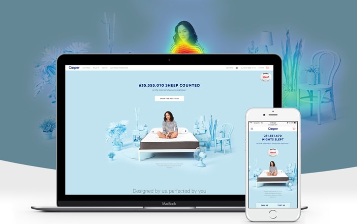
5. Placement of Images
Image placement is not just about what looks good, it is also about instantly conveying a message to your consumers when they land on your page.
Before you start moving around images on your landing page it is important to assess where your consumers are drawn to on your page by installing a heat map. You may also need to consider competing elements on your page and where they should be in relation to your image.
Case Study:
OnBase, a software company tested their image on the left with the sign up form on the right and then switched both to see what effect it would have on conversions.
They found that when the image was on the left and the sign up form was on the right, conversions increased by 11 percent.
Conclusion
Images are an important part of any landing page or marketing campaign, however they are only as powerful as the message they communicate.
Think about what message your brand is trying to communicate and then work from there to optimise your images for the best conversions.

Hey!
It looks like you're browsing in . Would you like to switch over to the website?