Is your pricing page compelling customers to spend or scaring them away?
Chances are one of the last few steps in your sales funnel is the pricing page and the last thing you want to do here is scare away your potential customers for good.
When putting together a website or e-commerce store, many businesses overlook the pricing page component. Sure, the dollars and cents matter but everything on the pricing page itself can either make or break getting the sale.
This is really where psychology and marketing come into play- there are many ways to make your price points more appealing or less appealing, regardless of whether you are offering a steal or quadrupling your profits.
Understanding these factors can help you turn your pricing page into a converting super power and the good news is that it is not as challenging as you think.
Here are five of the most important factors that you need to address when constructing a pricing page:
1. Headlines
Headlines grab the attention of your readers and allow them to know what to expect to find on the page that they are visiting.
When it comes to creating a headline for your pricing page however, the focus should really be on converting your readers into paying customers.
In fact, on your pricing page your headline should really be a well formulated call to action that motivates your audience to make a purchase. While it doesn’t have to be clickable, it is a good way to approach writing your pricing page headline.
You may also want to think about what emotions you want to stir up in your customers in order to encourage them to purchase- remember, purchasing is more emotional than it is analytical.
A good example of a pricing page headline comes from Team Treehouse: “Start learning today. Sign up for Treehouse”.
This two part headline instantly communicates to readers that they can start learning instantly and that they are going to be taken through the sign up process.
Another example comes from Trackur who uses a three part headline- “Start your free trial. No credit card needed. Trusted by 70,000+”.
This headline instantly allows customers to know that they are getting a free trial, that they don’t need to input their credit card and that they are a popular company. This works to instantly create a feeling of trust, security and low commitment.
To create your perfect pricing page headline, be sure to include:
- Information on what your user is going to purchase and where they are in the process, for example: sign up, free trial etc.
- A strong and emotionally driven call to action that motivates users to buy or sign up
- A non- transactional headline; try instead to keep it targeted and encouraging to your users
- Information that may help drive the sale, for example: no credit card needed or cancel anytime
- A clear statement that is short, to the point but also includes all the necessary information to attract customers
2. Benefits
Your pricing page should clearly outline the benefits of what your customer is going to receive as well as how your product or service can fulfil their needs.
Many companies make the mistake here of only listing what customers are receiving once they sign up, however it is far more powerful to also include how your products or service are going to enrich your customers lives and needs.
A list is the most effective way to communicate your benefits so be sure to keep your points brief, concise and appealing.
A good example of benefits listed on a pricing page comes from Constant Contact. On their pricing page some of their benefits have been listed as: send unlimited emails, award wining coaching and expert advice from our team.
Rather than just stating that they offer customer support, Constant Contact has raised the perceived value of their service by including terms such as “award-winning” and “expert advice.”
Using other key words like “unlimited” also helps customers feel like they are getting a good deal.
By following this example, you can really see how important it is to carefully select the words you use to describe your benefits and how you need to always bring it back to the customer.
Here are some more pointers that may help:
- Clearly highlight the main advantages that customers can expect from purchasing your product- don’t just go over specifications, instead allow your customers to know how your product is going to help them.
- Keep your points to a few sentences, having large paragraphs of text can be off-putting, you want your customers to know instantly what they are receiving instead of having them make assumptions.
- Don’t be pushy with your benefits and avoid using cliched terms like “the best” or “unbeatable”, instead back up your benefits with claims and provide insight as to why customers should trust you.
- Keep your benefits list to a maximum of 10, having too much content on this page can be distracting.
3. Be Transparent
Some brands think it is better to not reveal the price right until the final check out page, but studies have repeatedly found that this strategy does not work.
People want to know what they are getting into and customers what to know straight away how much they should be expected to pay.
Not listing the price instantly creates the feeling that your product or service is either ridiculously expensive or that you can’t be trusted. It may seem harsh but customers want transparency, they don’t want to have to guess or jump through hoops to receive important information from you.
If you do have a high price point, consider backing it up with benefits or offering a free trial. Another tip you can use is to keep the dollar sign small and the numbers larger, as studies have found that this makes customers feel less intimidated.
The same applies for added costs such as administration fees or shipping costs. Allow your customers to know that they may be expected to pay extra for these services from the start, rather than waiting till the checkout page.
Customers really do value transparency, so don’t hide away from your price point, instead own it and be confident in the services or product you are offering.
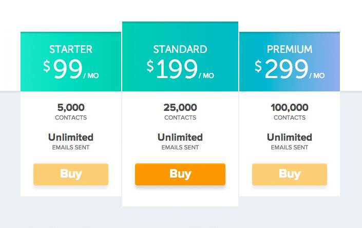
4. Provide options or comparisons
Numerous studies in behavioural economics have found that buyers don’t even know what it is that they really want until they see a particular choice compared to another.
This means that providing a comparison or options is key to helping your customers follow through with their purchase.
Comparing products or services also allows your customers to also feel that they have control and that they can choose which service is going to best fit their needs and wants. This helps to also create a sense of personalisation, which is a strong motivating factor when it comes to purchasing.
If your brand offers a variety of service options, break them down into 2-4 different package deals and include the benefits and price of each. You can also do the same with different products that your company offers.
While choice is good, you definitely do not want to have too many options as this can create confusion. Three options has been shown to convert best, so start with that and see how it works for your business.
You may also want to highlight one specific package option that is the most popular as this may help direct your customers in to making a decision.
When it comes to offering a comparison of your products and services you may also want to include:
- Interactive features that allow customers to change certain aspects of your product or service to see what options are available and the price for each.
- Distinct differences between the packages to make it easier for your customers to determine which one is a good fit for them.
- A stronger call to action or a different colour on the package deal that will best benefit both your customer and your business.
5. Overall Feel
Now that you have the critical components of your pricing page in order it is time to think about the overall feel. This includes the fonts, colour schemes and layout of your page, as well as your call to actions.
- Fonts: it goes without saying that you want to have your typography clear and easy to read. You may also want to consider having a standard font that can be easily read across mobile and tablet devices as well. Also, think about your audience- for example, if you are catering to an older demographic you may want to include larger, bolder fonts.
- Colours: there is a deep psychology behind particular colours which you can read more about here. You may also want to consider keeping the colours of your pricing page in line with your logo or brand colours.
- Layout: having a clear, clean layout will definitely help boost your conversion rate. Keep the noise on your page to a minimum and avoid having any unnecessary distractions. Listing your services in a table is often the best and easiest way to communicate to your audience what you are offering.
As you can see, creating the perfect pricing point is just the tip of the iceberg when it comes to converting readers into customers, it really comes down to the whole page.
Your pricing page is not so much about selling your product or service, it is more about showing your audience how they can really benefit by signing up or purchasing from your business.
Use your pricing page as an opportunity to get your customers excited and see how this angle can really boost your sales.
Hey!
It looks like you're browsing in . Would you like to switch over to the website?