
Have you thought about using Heat Maps but are not sure where to begin?
Here is all you need to know about using Heat Maps on your website and how they can help you increase conversion rates and boost sales.
An Introduction to Heat Maps
Google Analytics is a great way to understand how your audience are interacting with your site, but if you really want to go behind the scenes and work out precisely where your audience is drawn to when they look at your page, then you can’t go past Heat Maps.
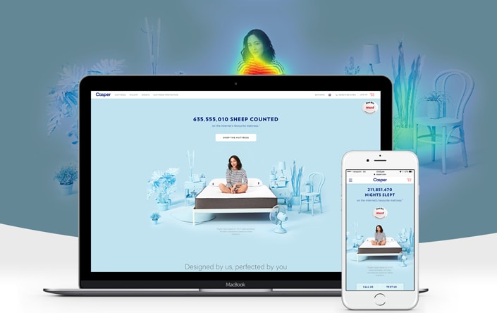
Heat Maps allow you to see the “hot spots” on your website and where your audience is clicking, where they are scrolling to and which part of the screen they are hovering around the most.
By definition, Heat Maps are “a graphical representation of data where the individual values contained in a matrix are represented as colours. Fractal maps and tree maps both often use a similar system of colour coding to represent the values taken by a variable in a hierarchy”
To put it simply, a heat map is like a two-dimensional representation of data where the values are shown as colours.
These colours then allow you to analyse what could be complex data in a matter of minutes.
For example, red or orange on your heat map indicates an area that is popular for users to hover over or click, whereas blue or even dark blue areas indicate an area that is not often frequented by your visitors.
When you are able to see your website with the heat map installed, it instantly allows you to understand where your prime real estate is on your page, where you can boost conversions and get your leads moving through your funnel.
Heat Maps are also quicker and easier to process as they don’t require you to sift through rows and rows of analytical data.
“Heat maps are well suited for visualising large amounts of multi-dimensional data and can be used to identify clusters of rows with similar values, as these are displayed as areas of similar colour.”
If you are thinking of using Heat Maps to help boost your conversions and grow your sales, here is all you need to know.
What Heat Maps Can Tell You
If you are a visual learner or you haven’t quite been able to narrow down the optimal conversion rate using programs like Google Analytics, than heat maps may just be what you need.
In a nutshell, heat maps can tell you two main things:
1. the number of clicks on a webpage
2. the amount of attention given to a particular area on your webpage
But from this simple information, heat maps can then allow you to determine:
- What your visitors are interested in when they come to your page
- What your visitors are not interested in when they come to your page
- If your call to actions are in a prime position or if there are too many distractions
- The flow of visitors and how they proceed through your website or through your funnel
- Parts of your website that need more attention or “cold spots” that need addressing
- How your call to actions are converting
- Which components of your site are resonating with your visitors
- Where your users are scrolling too and where they stop
- Where they loose interest in your site or your content
- Opportunities to improve your conversion rates
From this data, you can then determine where to place your most desired call to actions, images, sign up boxes and how to structure a page that actually resonates with your audience.
What Heat Maps Can Teach You
As we have already seen, Heat Maps are the perfect way to analyse the behaviour of your visitors.
There are many types of heat maps that you can install to learn things about how your customers interact with your website. These heat maps include eye tracking heat maps, mouse tracking heat maps and even scrolling heat maps.
What style of heat map you choose will depend on your objective, but each can offer you valuable insights into your demographic.
Over the years, researchers have collected data obtained from heat maps as a way to measure their effectiveness.
Here are some of the top findings sourced from heat map application over the years:
1. While users do scroll their attention span is usually short. Around 80 percent of visitors tend to view content that is above the fold whereas only 19.7% go below the fold.
This teaches us that all of the best and most valuable content should be at the top of the webpage above the fold.
2. People spend more time looking at the left side of the screen instead of the right. One study found that people spent twice as much time looking at the left side of the page than the right side. Another study found that the left side of the page received 69 percent of viewing time.
This teaches us that we should place our most valuable content on the left side of the screen. It also may be worth reconsidering the location of the sidebar, especially if it may be distracting users from the main intention of the webpage.
3. People tend to read your content in an F-shaped pattern. This means that they skim through the content and look for headlines, subheadlines and bullet lists. In fact, the average person is more likely to speed read your article than to sit there and read it in fine detail. To break it down, people’s eyes first went to the upper left side of the page and then they followed dominant headlines.
This teaches us that the first paragraph of your text needs to state the most important information and that your content should include sections and headings for easier reading.
4. Users tend to ignore advertising banners on the top of the page. Known as ‘banner blindness’ a study on heat maps found that ads at the top of the page were generally ignored or consumers were blind to their existence. The study also found that most consumers are very good at ignoring advertising, especially when it was in the sidebar or at the top of the screen.
This teaches us that it may be better to place your advertising banners elsewhere in order to obtain higher click through rates and ad revenue.
5. One study found that when there was an image of a person, users followed not where the person was pointing but where they were looking. Several heat maps installed on various sites with images of people found that users consistently followed the direction of the persons eyes.
This teaches us that psychologically, people are drawn to look where others are looking. It may be worth testing on your own site having a picture of a person looking at your call to action or opt-in box to see if it boosts conversions.
6. Heat map research has found that slider or automated banners or carousels at the top of a screen are largely ignored by users. This is believed to be for the same reason as ‘banner blindness’. One interesting thing that come out of this study however, is that a central banner that blends in well with the overall look of the site was able to catch a large percentage of attention.
This teaches us that automated carousel banners may not be the best option for attracting visitors and obtaining clicks, unless the banner is very well integrated into the layout of your site.
7. Having contrasting colours on your website is a great way to guide visitors to your desired action. One study found that areas of the website that were a contrasting colour attracted a large volume of attention. Certain colours like green, blue and orange appeared to be the most effective for call to actions.
This teaches us that in order to attract audiences, the most desirable call to actions need to stand out or be in a contrasting colour to the rest of the page.
8. One study found that images consistently received more attention than written content. The study also found that people were more likely to respond to photos of real people. In fact, 10 percent of users spent more time viewing photos of employees than reading the content about them.
This teaches us that including real images of your staff and employees is far more valuable than using stock images. Including real images also allows customers to get to know your brand on a more personal level. Images also have the ability to convey a story or a message without using words.
9. When it comes to opening email newsletters, around 67 percent of users skip introductory paragraphs and scan through the rest of the content. In fact, the average time allocated to the newsletter was only around 51 seconds. Another study found that only 19 percent of readers view the entire newsletter.
This teaches us that newsletters need to have strong call to actions and clear intentions as attention span is very, very low.
10. When it comes to collecting email opt-ins, having too many fields for people to enter can cause them to abandon the opt-in process. One study found that when users were asked to input too much personal information like their first name, last name and email address, they lost interest in signing up to email lists.
This teaches us that email opt-in forms should be very basic and simple and shouldn’t ask for any additional information other than their email address.
When used effectively, heat maps can be an excellent tool for gaining insights, but of course you must test these elements on your own webpage to see how they convert with your audience.
Installing a Heat Map
So now that you are convinced that you want to use heat maps to help boost your conversion rate, here is how to go about setting it up.
Firstly, it is important to pick a heat map software that works for you.
Here are 10 of the Top Heat Map Software Options we have sourced from around the web:
1. Hotspots Analytics: great for WordPress users. Simply download the plugin and try out their free version. Great for beginners or those curious over whether heat maps are a good choice for their webpage.
2. Heatmap for WordPress- Realtime Analytics: another great plugin for WordPress sites that offers a free version. It also comes with realtime analytics, mouse tracking and is responsive-design friendly. It also won’t slow down your site speed time.
3. SumoMe: also offers a free heat map tool so you can see what people are clicking on. It also offers a scroll box that triggers when a user scrolls down to a particular point on a page.
4. CrazyEgg: offers a premium heat map service and is one of the most popular options available on the market. It is widely used across many industries and was one of the first companies to offer heat map user data. The company offers many different heat maps ranging from standard to more sophisticated. Pricing starts at around $9 per month and the company claims to have a 88 percent accuracy rate with tracking.
5. Clicktale: is another premium heat map service that allows you to not only look at heat maps but also analytics. It also allows you to playback heat maps and records mouse movements, clicks, attention and scroll reach. It also comes with a mobile analysis feature as well. Although it is a paid service, Clicktale offers 400 free page views per month.
6. SessionCam: offers premium heat maps as well as user tracking. This tracking allows you to see exactly where users move their cursor to and from when they are on your site. It allows allows you to replay visitors actions and offers great troubleshooting options for links on your webpage.
7. Inspectlet: along with offer a premium heat map, this service allows you to playback everything a visitor does while they are on your site. You can also record what each person does while they navigate through your content. This type of information can provide keen insight into your conversion rates. It also comes with a funnel analysis tool to help you measure activity.
8. HeatMap.Ca: a heat map service that offers a dashboard tool that is not integrated into WordPress. It contains a lot of features and even a filter for monthly, weekly and daily visits. It is also compatible with mobile sites and offers insights on how to improve your conversion rates.
9. Reinvigorate: offers real-time premium heat map tools with an array of added features including the option to name tag specific users. The service starts at around $10 per month but they also offer a free trial for 14 days so you can test out the functions to see if they are a good fit for your website.
10. LuckyOrange: another premium heat map service that offers mouse movement recording and real time visitor maps. They also offer visitor polls and a live chat feature in case you are having any difficulties. Pricing for Luckyorange starts at around $10 per month but they also have a free trail period of 7 days.
Once you have determined which software is the best for your brand, here is how to go about using your heat maps to run tests and collect data.
Conducting your Own Heat Map Test
Most of the software programs listed above come with their own tests and analytical tools for you to follow, but here is a rough guide as to where you should begin.
Firstly, don’t test everything right away. Instead focus on just one or two elements that are the most important to you. Also, start out with just testing a few pages to begin with, this will help to keep everything simple and easier to manage.
Here is a full list of the pages you may want to test:
- Home page
- Product Pages
- Link Pages
- Landing Pages
- Resource Pages
- FAQ Pages
- Testimonial Page
- Blog Posts
- Portfolio Page
Once you have chosen a page, next focus on your objective. Think about what insights or information you are looking to troubleshoot on every given page.
For example, on your home page your objective may be to get users to click on one specific call to action, wheres on your landing page it may be an opt-in form.
From here, you can then best determine the type of heat map to use.
Once you have installed your heat map, analyse and assess the following-
- Is my number one objective the most clicked or hottest spot on the page?
- Which areas are the most clicked?
- Which areas are the least clicked?
- Which hotspots were unexpected?
- What type of medium is receiving the most clicks? (ie. images, text, buttons)
Once you have analysed these questions you can then work out how best to repurpose your hot spots to achieve your most desirable outcome.
Generally, the best way to use a heat map is to use an existing hot spot on your chosen page to achieve your objective, rather than changing the layout of your entire page.
Start by making small changes first and test everything, that way you can be sure that you are making necessary and appropriate changes.
Heat Maps In Action
While it is all well and good to read about what heat maps can show you and the benefit they can provide, here are some real case studies that will hopefully shed light on what heat maps can actually offer a working business.
Case Study #1
Softmedia used heat maps to identify problem areas on their website. Once they installed the heat maps, they were able to see that they had too many distractions that prevented users from completing their most desired call to actions. After removing these distractions, Softmedia noticed a 51 percent increase to their conversion rate.
Case Study #2
Conversion Rate Experts wanted to improve opt-ins on a particular page. After installing a heat map, they were able to see that some visitors were distracted by the content on their side bar. After noticing this, they split tested a page with a side bar and with no side bar and found that the page without the side bar increased conversion rates by 25 percent.
Case Study # 3
Pagely installed heat maps and found that 25 percent of users only scrolled to about 600 px before leaving the site. Once they had this information, the company reconsidered their layout and where they placed their most important information. They also developed a menu bar that took people exactly where they needed to go for certain information, this helped the company to boost conversion rates.
Case Study #4
Harry Fay Jewellery Boutique wanted to discover why they were experiencing a profit leak. They installed a heat map and discovered three critical errors including failing cookie notifications, social media distractions and unanswered questions in the ordering process. After identifying these errors, Harry Fay was able to make some design changes and boost profits.
Case Study #5
The company, WPMU Dev used heat maps to see how visitors were interacting with their product pages. From this they were able to determine that parts of their navigation bar were ignored and most of their videos were unwatched. With some simple redesigning, WPMU Dev were able to boost their conversion rates and increase the number of sales.
Summary
Heat maps offer you an inside look into how visitors see and respond to your site. This allows you to not only design a better website but it also allows you to boost conversion rates and move more leads through your sales funnel.
Heat Maps Show You:
- If your visitors are distracted by too many choices
- How to improve conversions and click through rates
- What to emphasis, repurpose or remove from your webpages
- Which images are areas of your page are drawing the most attention
From this information you can then determine how best to structure your pages while keeping your objective in mind.
For example, if your call to action button is in a “cold spot”, moving it to a “hot spot” without changing anything else on your web page may just very well be the conversion boost you were looking for.
Heat Maps are a great way to optimise your site and learn more about how your users are interacting with your page, why not install one today and see what it can reveal to you about your website.


Hey!
It looks like you're browsing in . Would you like to switch over to the website?